28

What are the factors that should affect whether my visibility will be higher with a "high visibility Yellow" vs. a "high visibility Orange" vest or jacket?

It seems too simplistic to simply say "Yellow is better" or "Orange is better' - there are a number of conditions that I often note affect my perceived visibility (n-1): day/night, foggy vs. direct sun, perhaps the ambient foliage? I want to separate this question from discussions of retroreflective strips, retroreflective tapes, or nighttime lights - I'm trying to understand the differences between the two colors first and foremost with this question.

I have reviewed the following questions but did not find discussions of color-based visibility:
How can I make my bike (and myself) visible at night? - Focuses exclusively on night-time conditions, primarily focuses on retroreflectivity and adding lights to the bike
Night cycling: Is it worth using electroluminescent wire? - Same as above
Is fluorescent clothing effective? - Does not address different color options for high visibility clothing

10 Answers 10

32

The short answer is that, in practical terms, the difference isn't great. The longer answer requires some explanation of "visual conspicuity."

In optical engineering, conspicuity is the study of what makes things "conspicuous," and some researchers split the tasks into "detection" and "identification" (see, for example, the works of A. Toet et al, such as this one). Because the rods and cones in our eyes have differential sensitivity to light and color, some colors are more easily detected in low-light conditions, such as dusk or dawn (the rods are more sensitive than the cones but are essentially insensitive to color -- that's why all cats are grey in the dark). However there's still the "identification" task, and that's where the choice among high-visibility, naturally-rare, colors matters.

In general, in order to be conspicuous, you want both to be detected and to be identified as a cyclist. Experiments with the visually impaired (and color blind) show that contrast is the key. Contrast can be achieved by shape, motion (which is why emergency vehicles have blinking lights: to achieve "optical" motion), and color. What this means is that the color you wear should be differentiable from the background, so you want a color that is both detectable in a crowded visual field and also that is uncommon -- or rather, uncommon compared to other objects in the visual field but common to cyclists so that you can be identified as one (cf. here and here). The fluorescent colors of high-visibility yellow-green and high-visibility orange are pretty unnatural so the likelihood that it will be "lost" in the visual field is low but in addition, the fluorescent yellow-green seems to be commonly used only by cyclists and emergency workers (like firemen) -- at least, in the US. Conversely, hunters wear orange both because it's not just a good idea, it's THE LAW, but also because it's instantly identifiable by the conventions of hunting.

So the bottom line is that both are detectable though there may be some (slight) advantage to using the color that is most commonly associated in the public view with cyclists since it is both highly detectable and also identifiable. Should you be riding in an area where another color is (predominately?) associated with cyclists you might decide, of course, to use that instead; for example, during some long-distance randonnees (see, for example, the requirements for the quadrennial Paris-Brest-Paris ride), the organizers may require that the cyclists wear a belt or vest or other device of a particular shape or color so that drivers can instantly recognize and identify the carrier of such a device as a cyclist.

4
  • 1
    A picture I saw today indicates the importance of the colour being uncommon in the background. Who's more visible? not the one in hi vis
    – Chris H
    Commented Mar 30, 2021 at 15:54
  • 1
    And for PBP, compliance with French law has become a significant factor (must wear approved high-vis after dark)
    – Chris H
    Commented Mar 30, 2021 at 15:57
  • @ChrisH This answer is almost 10 years old, and it holds up pretty well.
    – R. Chung
    Commented Mar 30, 2021 at 18:27
  • @R.Chung it does; for some reason this question was active today, a few minutes after I saw that picture of Queen Elizabeth surrounded by orange-clad railway workers that I thought illustrated one of your main points nicely. Then I realised French law had moved on, though the effect here is very minor. Finally I noticed the date!
    – Chris H
    Commented Mar 30, 2021 at 20:25
18

YELLOW - and according to EN471...

There are regulations for high visibility clothing used by people that work on highways. Their employers have a duty of care to make sure they are in the correct HV wear. In the UK the standard is BS EN471 and this applies pretty much the same across the whole EU.

3M - the people that pioneered high visibility clothing - have a summary guide. Of note in the guide is the reflective bands and their placement. For a tabard they go something like this:

http://solutions.3m.co.uk/wps/portal/3M/en_GB/Scotch-Lite/Home/RegInfo/LocalHiVisRegs/

enter image description here

I believe it is best to stick to the standards deemed appropriate by the experts on this matter. That means buying a tabard for less than a fiver from some place that sells work wear. That does not mean spending £30 to get some cyclist version of the high-visibility wear that does not pay attention to the EN471 standard.

Let's stick to conventions

Another really good reason to wear that greeny-yellow is that it is a convention. Motorists recognise cyclists as cyclists when wearing that particular colour. With flourescent pink they have to think about it, with orange they wonder if that is a dustman.

10% of us males are red/green colourblind!

Orange was the original high visibility colour for railways in the UK. To get a job as a train driver you have to be able to see properly. Therefore orange worked very well, sticking to the convention of using orange as a hazard colour (with red as stop and green as go).

There is no colour blindness test in the driving test. With one in ten males not able to discern red and green properly the yellow-green colour trumps the orange that is nearer red.

Here is a study that goes into this in more depth:

http://www.dartmouth.edu/~sullivan/bike/colorbv.html

And a couple of handy diagrams. This one has tarmac grey and 'ambient foliage' with a spectrum of bright colours:
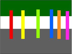
enter image description here

Here is what the average colour blind person sees:
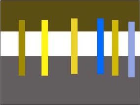
enter image description here

The practicalities of dirt

Personally I wear orange on some days (my orange top has sleeves that are useful in the winter cold) and yellow on other days (it has no sleeves). The observation I have made with the orange jacket is that it gets dimmer with dirt whereas dirt tends to contrast on the yellow-green top. This is true for diesel particulate dirt as well as random patches of oil etc. The EN471 spec does have a few words about keeping high visibility garments clean for them to work, this seems more crucial with the orange colour. This is only anecdotal.

4
  • 2
    I figure they'll keep changing the color periodically in order to sell more vests... Commented Aug 22, 2011 at 18:25
  • +1 over «with orange they wonder if that is a dustman»
    – ZJR
    Commented Aug 22, 2011 at 20:14
  • Interesting point about colour blindness. My dad's colourblind, I might try doing some experiments on him.
    – Tom77
    Commented Aug 23, 2011 at 15:05
  • 6
    I don't get it -- those two diagrams above are identical!! Commented Oct 11, 2013 at 22:00
15

enter image description here

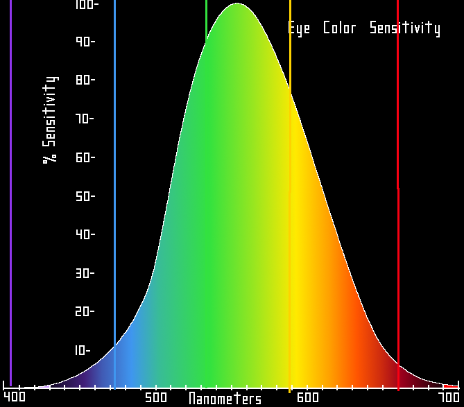
The human eye is more sensitive to some colours, peak sensitivity is at the yellow-green portion of the visible spectrum.

So generally speaking, a yellow vest or jacket should be better than an orange one.

8
  • In theory... Yes
    – Ambo100
    Commented Aug 22, 2011 at 17:39
  • 1
    In terms of pure visibility this is correct. In the US many road signs, construction vehicles, and other applications of warnings are being transitioned from the older orange to the greenish yellow. The main point in color choice to to ensure something which may not always be present is highly visible so as to attract the eye. The color itself isn't intended to convey much meaning beyond "HEY!"
    – STW
    Commented Aug 22, 2011 at 17:39
  • 3
    I always thought the sensitivity difference was that we could discern between more shades of yellow/green than we can of other colors. Not that they're necessarily more eye-catching or attention-grabbing. Commented Aug 22, 2011 at 21:44
  • 6
    That chart is idealized/inaccurate -- the sensitivity of the human eye is quite irregular, based on the response curves of the three different cones (plus the rods). In addition, a significant % of people are red/green colorblind, making their curve different still. Probably best is a specific color that strongly activates one set of cones and not the others -- this will be more "fluorescent". Commented Aug 23, 2011 at 2:03
  • 3
    "Ambient foliage" - in nature things that want to be noticed, e.g. flowers, fruit and tail feathers tend to be at the far ends of this curve as, thanks to photosynthesis, the 'ambient foliage' is a shade of green, that green ranging from dark green to yellowy green. Therefore, simple 'we have got lots of green receptor cones in our eyes mostly' answers don't cut it. Contrast comes into it too. Commented Aug 23, 2011 at 2:36
9

I think the best approach here is one of convention rather than the physics of color sensitivity, in other words, consideration for what makes the most sense to an approaching driver. In north america, "slow moving vehicles" (such as farm tractors and Amish buggies) use an orange triangle with a red border.

The point of such markings is to communicate to the driver what is front of them with as little cognitive load as possible. With orange, you more clearly convey "slow moving vehicle" or maybe "traffic cone". With yellow, the driver might have to have to think about whether that yellow blob ahead is a cyclist or traffic sign.

That said, it doesn't matter too much. The important thing is to have significant contrast with the rest of the environment.

One side-issue to keep in mind is that the time when visibility is most degraded is NOT at night. The worst time for visibility is at dawn or dusk, when there is enough light to "see" everything, but not enough light for good visual contrast between things on/near the road. For this reason, your most important safety device is a nice bright rear light.

4
  • Very good point! Commented Aug 22, 2011 at 17:10
  • This is why I elect to have a bright blue or pink rain jacket for day cycling and walking. Yellow and orange are seen but ignored as 'well known' but different colours are really seen.
    – Willeke
    Commented Jan 15, 2017 at 12:48
  • It's unlawful. So no! Bicycle aren't consider a SMV. A bicycle can go faster than 30 Mp/H.
    – MathCubes
    Commented Aug 27, 2019 at 7:34
  • Good point about dusk and dawn (or dull weather, or fog). But keep in mind that hi-vis is not just a passive colour, but it converts UV into visible light and is particularly effective in these low-light conditions as it is much brighter than any normal yellow or orange surface would be.
    – uUnwY
    Commented Mar 29, 2021 at 14:16
5

Yellow and orange high visibility vests both do a good job of reflecting light. The Wikipedia article on high-visibility clothing mentions the first use of 'safety' orange

Experimental use of high-visibility clothing began in 1964 on the Scottish Region. Fluorescent orange jackets, known as "fire-flies"

What isn't clear in the article is how effective the orange colour is. It was noted however 'the rate of deaths and injuries on the rail network has been reduced considerably'. I don't think there is enough research to prove any major difference between the two. Perhaps at the time it was about distinguishing rail workers from public service workers.

I think it's also a matter of preference, from a UK site that sells high-vis jackets the choice of colour appears rather inconsequential. What ever colour you choose it's likely that the retroreflective stripes will be the most effective.

2
  • 1
    ...not sure what pigments were available during this early high-vis work, so orange may have been the only option going back then. Commented Aug 22, 2011 at 17:37
  • 1
    Railway workers in the UK still wear orange because (I have been told) lime green is too similar to 'green for go' and orange is nearer the colour of a red stop light.
    – DaveP
    Commented Oct 13, 2013 at 14:32
2

I strongly suspect that the color difference is statistically insignificant. Probably of more importance is the shape/size and other attributes that help to catch the eye. Except in dense fog (where a flashing light is the best option), the problem is not so much being seen as being recognized.

2

You have to understand this: the purpose of a safety vest is to set yourself apart from an environment.

So logically speaking, you can buy both :

  • one for in autumn, yellow, since most leafs are orange then and if you where to wear the orange vest, you wouldn't set yourself apart from your environment but you would blend in with it.
  • one for in the rest of the seasons : orange.

However, it's more than merely looking at the changes in environment due to seasons, you should also look at multiple other factors :

  • the most occurring color in an area : if in one city there happens to appear lots of yellow houses, then you shouldn't wear the yellow vest and vice versa.
  • the most common color associated with cyclists in an area : if cyclists tend to wear yellow safety vests more in one area, you might want to consider doing the same, so you can be recognized as a cyclist by others (cars etc.).
  • the human eye's sensitivity to colors, as described above.
  • colors which are distinguishable amongst the colorblind.
  • Reflective inserts Reflective horizontal stripes and arm cover will improve visibility, glue some of them on the back of your vest and/or on the arms.
  • follow the regulations
2

I am a utility worker in the US. I finally used my last orange vest, and I was presented with a lime green one by my manager. We were outside when he handed it to me. I looked at the vest, then at him, and then I threw it in the thin patch of growth near by.

After a choice word or two, he asked me what I did that for. I responded with, "Where is it, John?" At only 12 to 15 ft, he was unable to see it against the trees and brush. I threw my current orange vest (neither new nor clean) into the woods right near it. It was much more visible to say the least.

The yellow green is silly on many levels. First, I think it more closely matches the colors of autumn and of course of grass throughout the year. I also think fire=red blue=police and orange means construction. I avoid things colored orange in a safety zone. I will also avoid things colored yellow or green in a safety zone, but I am looking for orange. After many photos in different lights and at different distances, I conclude that the orange is superior in daytime working environments.

I also have come on flaggers in yellow and green recently that are dancing with their stop signs to get drivers attention. I don't have a stop sign and would really like to go home to my family at the end of the day. Just my 2 cents.

1
  • 2
    I don't know where you live, but yellow-green is hardly the color of fall where I live. In fact, orange is precisely the color of fall. Your opinions are fine and all, but there is solid science that says your opinions are in fact quite wrong. Commented Oct 12, 2013 at 0:23
1

My understanding is yellow is better for moving objects and orange is better when you're lost and needed to be found/rescued. Consider the following quotes from Wikipedia (not exact colors, but close):

School bus yellow "The color was chosen because it attracts attention and is noticed quickly in peripheral vision, faster than any other color. Scientists describe this as follows: "Lateral peripheral vision for detecting yellows is 1.24 times greater than for red."

and

Safety orange "Safety orange is used to set objects apart from their surroundings, particularly in complementary contrast to the azure color of the sky (azure is the complementary color of orange, and therefore there is a very strong contrast between the two colors)."

however

Hi-vis clothing

"A 2009 Australian study of drivers trying to see stationary cyclists on a closed circuit found that fluorescent vests (without retro-reflective stripes) were not a significant improvement on black clothing at night, and that retro-reflective strips were more effective when attached to knees and ankles than on a more or less static jacket."

So maybe we should just drop the vest and put reflective strips on legs.

1
  • 1
    I think the advantage of reflective vests is that the material is farther off the ground, giving cars a better chance of seeing it even if the lower half of your body is obscured by traffic. But when reflective bands on your legs are visible, the movement attracts attention and clearly signals that you're a cyclist. So a cyclist should wear both - reflective bands on the legs, and other reflective gear above the waist.
    – Johnny
    Commented Oct 14, 2013 at 19:12
0

From personal exp. (yes I understand this is anecdotal...) I like to wear "flight jackets" this is the same jacket a pilot would wear or a cover-all worn on a flight deck. it is functional for the following three reasons:

  1. shiny & waterproof external material is reflective
  2. Frequently; it is worn in conjunction with fluorescent yellow
  3. While walking; the reflective orange is visible

This is ideal both for flight decks, tarmacs, airfields and anywhere where its (a) dark and (b) moving vehicles use flashlights or headlights.

In my case; I was walking through a crosswalk; on a flat; it was a clear night (infinite visibility) and due to my stride+jacket; the orange material AND reflective blue were visible to any class C (the lowest driver clearance).

THIS driver was in his late 80s; clearly the California DMV was in dereliction of duty; as well as his ins. company; whom I've settled with so I won't libel.

The elderly 'gentleman' hit me with his white Infinity Q45v doing 40mph.

****injuries follow**:**

  • broken femur severed femoral arteria-->requiring tracheotomoy
  • gold fuse used to attach remains of femur
  • knee replacement - joints/bones/ligaments/everything
  • plastic surgery/periodontic/endodontic (>40 procedure) to face, neck, chin...
  • nerve damage (irreparable) to right hand, foot & calf
  • Orthopedist gets approval from UCLA and Feds to design/build/install/test artificial right leg that LOOKS real
  • List item
  • "dr. o" also approves PT (out-of-pocket-HIS) to send me to year of PT same PT CA Angels use
  • concussion (irreparable; but gets better over time)

Sorry for OT - to answer - I prefer YELLOW -[]

Not the answer you're looking for? Browse other questions tagged or ask your own question.